Monday, October 6, 2014

Colour Me Busy!

Hello and Happy Monday!

I am busy with the Hope You Can Cling To challenges over at Splitcoaststampers.  They run through the entire month of October.  I will be hosting a challenge on the 14th, plus I am making a few samples for other hostesses.  I am also having fun commenting on the gallery submissions.  Great stuff!  I am also busy trying to move posts over to my other blog.  I have redone my speaker/writer site, so I am moving my cards back over to my first Blogger site.  More people follow me there!  LOL  So yes, busy busy busy!

I have a card for the most recent Colour Me...! challenge, and even my husband likes how it turned out!  WooHoo!

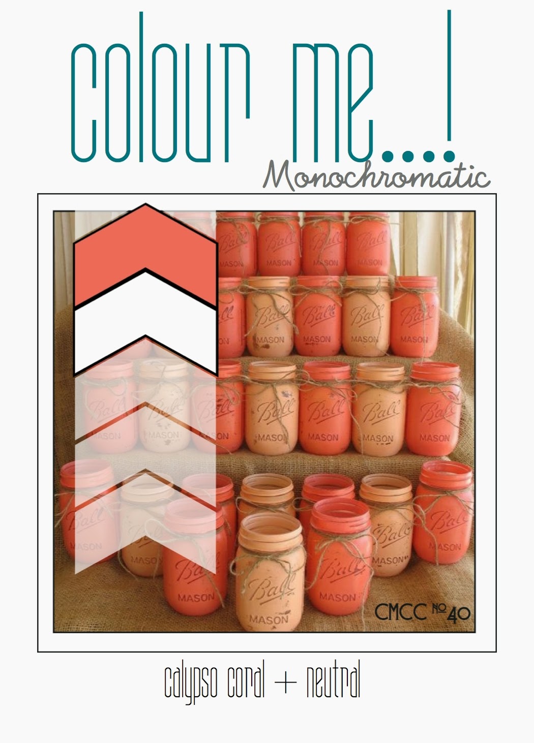
I have an old designer paper stack from S.E.I., called Black Orchid.  I pulled it out recently for 2 other cards, and it is perfect for this challenge to.  The coral is a perfect match for SU's calypso coral.


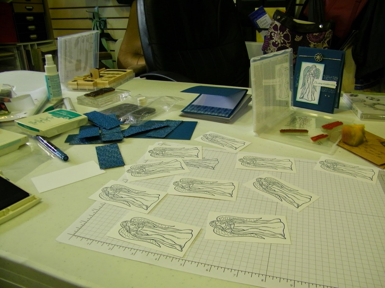
I used my SU Framelits to cut out the layers of whisper white and this embossed black paper from SEI.  Using markers, I colored the stylize flower from "Friends Never Fade" in smokey slate, calypso coral, and crisp cantaloupe.  The sentiment of from "Trust God."  I added satin ribbon and bakers twine for final detailing.  This is a very flat card...because I am out of dimensionals!!!  GASP! But at least it will be easy to mail, right?  I can't place an order for at least 10 days.  Flat cards on the way!  LOL 


Now, I am posting a non-challenge card...just because.  Last Thursday night, my husband said he got me a "commission."  One of his co-workers needed an anniversary card for his wife...on Friday!  Yikes!  I asked about favorite colors, wedding colors, themes, anything.  The man just said something with copper or bronze.  Hmmm.  I remembered another S.E.I. paper stack from years ago, called Charlemagne. Took me forever to find it, but it was perfect.


Isn't that a rich pattern?  Can't believe how long I have neglected this beautiful paper!  Any who, I paired it with basic black and tempting turquoise card stock.  My turquoise is embossed with the fancy fan folder, and embellished with copper brads from Hobby Lobby.  The sentiment is from SU's "Loving Thoughts" and it is embellished with a copper spiral clip, also from HL, and a but of SU white organza ribbon.  The card is a bit larger than an A2 (I have some miscellaneous envelopes.)  Turns out the man was really impressed with the card, and he paid me more than I requested, since I did it last minute.

I told my husband he can keep working on those commissions!  LOL

Thanks for stopping by.  I'll post when my other blog is ready to go.

Inky {{{HUGS}}}
Kim

Monday, September 29, 2014

Time for Color!

Good Morning!  It's Monday, and that means I have to finish my Colour Me...! challenge card before the deadline, right?  Well, it didn't happen on time...but here is my card.


This had me stumped or a while, plus I did NO stamping this last week.  Not any challenges, not any "just because" cards.  So, I am trying to get things going.  Well, I saw a sneak peak of the Technique Lovers Challenge last night, and decided to incorporate it with these colors.  Anne calls this technique "Punched Strips" and it looked simple and fun.


I embossed a layer of whisper white with the Cloudy Day folder, lightly sponged, and placed it on the bermuda bay card base.  The brights pattern paper stack worked perfectly for this challenge, and I used my old butterfly punch for some whimsy.  The sentiment is from "On Your Birthday" paired up with both tag punches.  Daffodil grosgrain ribbon and candy dots add the final touches.

This was nearly done on time, but better late than never!  Hopefully, I'll be back next week!


Inky {{{HUGS}}}
Kim


Monday, September 22, 2014

I'm Back for More Colour!

Hello  and Happy Monday!

Last week was the first week I missed the Colour Me...! challenge since I discovered it this summer.  I was thinking about it, but had other things on my mind.  I had surgery on the 16th, so the days prior were spent taking care of other stuff.  I got home on the 18th, slept most of the 19th...but did some stamping yesterday, which felt wonderful!  Originally as I typed this last night, I didn't have any catch-up challenges included.  But this morning, I found a bit of Monday mojo!  Before I describe my card for the challenge I missed last week, let's look at the current one.


I looked on my scrap pile...which never seems to shrink...and I had pieces of pattern paper in all of these colors, plus a large piece of sahara sand.  Perfect to make 2 cards. I decided to use various punches to make vases for these "Pocket Silhouettes" from SU.  I used the ornament punch, scallop circle, and large oval, and just cut off pieces to get the shape I wanted.  The sentiment is from "Whimsical Words" punched out with the modern label punch.  I sponged pool party ink and added blushing bride candy dots.  I also had fun scrunching up some seam binding as my final detail.  This card is nearly flat, but I think it has a lot of interest.  Who knew 4 punches on one card could work?


Now, for last week's combo...which was a bit tricky.  Somehow, I remembered that I wanted to use this "By the Tide" stamp set...and I'm so glad I did!


My card base is coastal cabana, with a layer of basic black pattern paper.  On my layer of whisper white, I stamped the coral with hello honey, then used a pencil eraser to make the bubbles for the fish.  I dry embossed it with the Cuttlebug divine swirls folder.  My fish is stamped with Stazon jet black, colored with the honey and cabana markers, then heat embossed with clear powder.  After fussy cutting, I popped him up with dimensionals.  The sentiment is from "Word Play."  After cutting it out, I used my black marker to outline the tag.  I colored white organdy ribbon with my markers, threaded the tag, then used my heat tool to shrivel it up a bit.  Love this final touch!  

Well, I need to take it easy today.  Stamping may not be a rigorous hobby, but I am still in recovery mode.  Guess I'll take a nap and dream up designs for more cards!

Inky {{{HUGS}}}
Kim

Sunday, September 7, 2014

Color Me a Bit Early!

Happy Happy Sunday!

It took me a while, but I finally got my weekend stamping mojo going!  I was gone for most of yesterday, and surfed blogs in the evening.  After church and breakfast this morning, I caught in the quicksand that is Facebook.  Ha!  But I realized that I have a very busy day tomorrow, and would not have time to complete the Colour Me...! challenge. I decided I better do it today, which is "early" according to my usual practice.  This week is the monochromatic challenge...always tough for me!  


I had some different DSP out, from Garden Walk, or something.  I wanted to stamp over it with that big beautiful "Swallowtail"...what a mistake!  I can never get that image even!  LOL  So...I had some paper from the brights pattern stack.  I used this side that is a bit lighter, and stamped the large flowers from "Inspired by Nature" in basic gray ink.  In the upper left corner, my sentiment is from "Work of Art," and I sponged a sun with sunbeams in daffodil delight ink.  I added satin ribbon and large pearls to highlight the birthday wish from "Teeny Tiny Wishes" which is layered on various punches.  I have a friend who LOVES yellow, and her birthday is this week.  Perfect!


Now, since I am stamping "early," I am back to catching up with past challenges.  Just as a reminder, this blog challenge at the start of 2014.  I had already set a personal goal of completing each of the SCS color challenges this year (not necessarily in order) so when I found Colour Me, I decided to do the same.

Here is CMCC #12.  These subtle color challenges are almost as tough for me as the monochromatic ones!

The cool blue tones made me think of a cool winter theme.  I stuck with that, even with the warmer pear pizzazz color.  My card base is soft sky (FINALLY bought some!) On the strip of whisper white, I stamped SU's "Serene Snowflakes" in soft sky and coastal cabana, then sponged soft sky along the edges.  My pear circle was cut with the Sizzix die.  I brought out "Zoo Review" for this cute polar pear, which is stamped in basic gray.  After punching it out with the extra large scallop circle, I did some more sponging and stamping.  I also added some Dazzling Details on the ground beneath the bear's feet.  First time I have used this stuff...it was stashed away...and now I imagine it will be used quickly!  My sentiment is from "Happiest Birthday Wishes."  I added some silver ribbon for the final sparkling detail.


And finally for today, here is CMCC #13.  I LOVE this rich, vibrant palette!  This is more in my comfort zone, especially as fall is quickly approaching.


I decided to combine these rich colors in my own pattern paper.  I stamped leaves from SU's "Gently Falling" which is a 2-step stamp set.  After using the cajun craze, crushed curry, and rich razzleberry on very vanilla card stock, I sponged island indigo for a dark afternoon autumn sky.  I matted it with island indigo and placed it on a cajun craze card base.   My sentiment is from "Whimsical Words." I paired the scallop circle (very vanilla) and extra large scallop circle (crushed curry) punches, with dimensionals in between.  I added just a bit of cajun striped grosgrain ribbon for the final detail.


So, those are my cards from today's little stamp fest.  Lots of fun!  I hope you enjoyed them, too!


Inky {{{HUGS}}}
Kim

Friday, September 5, 2014

Triple Challenge Card

Happy Friday!

Today I have a card I made on Wednesday.  I intended to  re-do it, because I wasn't thrilled with my execution...but I just started a new consulting job (WooHoo!) so I haven't had time to stamp.  Since one of the challenges is The Paper Players, I decided to go ahead and post it.  I used the center vertical row...green, embossing, and ribbon!


This card also works for the SCS Sketch challenge #503 (last week) and SCS Color challenge #494 (this week) which prescribed wild wasabi, melon mambo, and basic gray.

I started with a basic gray card base, and added some melon polka dot paper from the pattern stack.  I used the scallop trim punch on the bottom edge.  My wild wasabi card stock was embossed with the fancy fans folder, and I used a corner rounder punch on the outside panels.  The floral images are from SU's "Vintage Vogue" and the sentiment is from Stampabilities.  All of the stamping was done with versamark on whisper white card stock, then I used clear embossing powder.  With sponge daubers, I added the wasabi and melon ink, in the emboss resist method.  The center panel had flowers, then I realized I need a sentiment that fit the sketch.  When I re-do this, I'll make that panel fit better!  Melon mambo polka dot ribbon and candy dots finish it off.

So, I like my design...just need to tweak it a bit.  Tell me what you think!


Inky {{{HUGS}}}
Kim


Wednesday, September 3, 2014

Birthday Giraffe

Hello Stamping Friends!

Quick post here, just in time for The Friday Mashup deadline!  I really wanted to do both parts of this Mashup, which meant doing a shaker card.  But it just wasn't happening!  I still wanted to participate, so I did the other part which was to include an animal.


In my efforts to use scraps and such, I had this card base with this Autumn Spice DSP already attached.  So I decided to go with the earthy colors.  I pulled out SU's "Zoo Review" for this giraffe.  My mom absolutely LOVES giraffes!  I plan on giving  this to her later this year (her birthday is in November.)  I love how the hints of the color pool party in the dsp works for a clear African sky.  My image was stamped on vey vanilla card stock with Stazon jet black, and colored with more mustard and soft suede markers, then I added grass and sponging for the ground and sky and matted it on soft suede textured card stock.  I used "Inspire by Nature" for backbe ready for the nextground grass on the card base.  The sentiment is from "Teeny Tiny Wishes." paired with the word window and scallop oval punches.  Ruffled ribbon finishes it off.


Now, it's time to clean up my mess so I can be ready for the next Mashup to be posted in 2 days!  WooHoo!

Inky {{{HUGS}}}
Kim

Monday, September 1, 2014

Inspired by Pillows

Hello!  It's another post for a Monday!

Every now and then, I remember to look at The Card Concept blog.  It's still new to me, so I need to put it on my calendar, so to speak.  This one really caught my eye last week.  I actually made 3 cards; all the same design, but I was trying to get one "good enough" for a picture.  Fortunately, dear hubby was around today to take care of it!  This inspiration for the challenge is here:  

I instantly thought of the color summer starfruit and decided to pair it with smokey slate, as in the shadows of the photo.  I was also inspired by the pillows and the flowers, which I used in stamping and embossing.  I consider my card "Clean and Layered."  The top layer of smokey slate is embossed with SU's petals-a-plenty folder.  My stamped flower is from "Baroque Motifs" and the sentiment is from "Hello Again," all stamped on whisper white squares.  I added some stitched satin ribbon for the final detail.
This should be an easy design to make in many colors!  Now I am off to The Card Concept blog to comment on a few other submissions!

Inky {{{HUGS}}}
Kim

Color Me Addicted

I'm addicted to Monday morning stamping!!!

So, I wake up and realize "Today is the deadline for the Colour Me challenge!"  With the holiday weekend and various projects I had last week, I had barely given it a thought.  I mean, I don't HAVE to do this challenge every week, right?

So, I did morning prayer with my husband then we ate breakfast, and played a game of cards. (We play 500 rummy and keep track of wins in a notebook...it's a silly little competition which he is winning by quite a margin.)  Then I dazed at my Facebook posts and took care of a few other things.

Hmmm, and my mind went back to the challenge.  By this time I had 55 minutes to create a card and post it.  It became a challenge just to do the challenge, no matter what my card looked like!  


Here is the palette for Colour Me...! challenge #35.  A bit tricky, I must say.  I remember I wanted to do something with water and fish and make a shaker card (another blog challenge) but that wasn't happening in this rush!

When a color combo is tough for me, I often do a collage style in my stamping.  I used SU's stamp set "Bliss" for this card.  True confessions:  I stamped the large flourish once, then inked it up again to make a pattern, but I dropped my block.  The mistake turned into a new plan to stamp all over this vanilla card stock!  I decided I needed some interest, so I used my top note die.  The sentiment is punched out with the scallop oval and sponged a bit.  I added a scrap of pink pirouette that is dry embossed with SU's petals-a-plenty.  Satin ribbon, which is scrunched up a bit, and some large pearls add a girly touch.  Between the embellishments and dimensionals, this quick card turned out rather plump!  Ha!


Well, I am happy to say that I BARELY got this posted on time!  In fact, when I first posted, I only had the pictures in the post...I am writing up the details after the Linky closed.  I didn't even know where the good camera is, so I used my phone.  Clearly, there was no time to do past challenges in this post.  Perhaps I should start those this afternoon for next week!

Inky {{{HUGS}}}
Kim

Monday, August 25, 2014

Colour Me Up Late at Night

Happy Monday!

Long story short, my husband will be working third shift this week, and he started last night.  So I was up stamping & blogging while he was working hard.  I want to get my weekly Colour Me fix in!  I ended up making 2 cards (#2 and #3 in this post) before I went to bed.  The first card was made this morning, just in time for the Linky deadline!

This week, CMCC#34 has a very nice soft palette.  I also decided to combine this challenge with The Friday Mashup.  The FM challenged us to use the Bokeh technique (I have seen it, but never tried it) and/or die cuts.  The FM blog had a link to one tutorial, but I attempted THIS tutorial instead.  I give myself a D-.  LOL


First, the simple stuff.  Card base is crisp cantelope, with layers of lost lagoon and watercolor paper.  The cantaloupe and calypso coral butterflies are from the SU Beautiful Wings die, and they are dry embossed with the Beautifully Baroque folder and detailed with a string of rhinestones.  The sentiment is from "Work of Art," punched out with the scallop circle, and placed on top of coral ruffled ribbon.
 Now, the actual Bokeh technique, as described by Lydia in the tutorial, is supposed to look "dreamy".  I do not have an ink pad nor ink refill, just a marker in lost lagoon.  I wanted to have a sky look (like Lydia's card).  So, I colored on top of a plastic bag, then added water and swirled with my aqua brush.  I used a pencil eraser for the dots, but they either seemed all dark or barely visible.  Oh well.  To add shimmer, I then added my shimmer spritz to the lost lagoon ink (still on the plastic bag.) I made more dots, crossing over some of the darker ones.  It just didn't looked filled in enough, so I used my aqua brush with the crisp cantaloupe ink to swoosh color in 2 areas.  Oh my!
 If I wasn't running up against the Colour Me...! deadline, I would have tried again.  At least I have the correct colors for that challenge, and I have die cuts for the Friday Mashup...so it's not a total loss.

But let's move on!

I skipped this challenge last week due to time, but I am continuing my game up catch-up with the 2014 challenges.  CMCC#9 is a rich palette, and I am sure I will use it again.   


My card base is basic black, the smokey slate layer is dry embossed with the Cuttlebug Divine Swirls folder. I added a layer of bermuda bay pattern paper (the old kind, when it was an In-color!) accented with bermuda bay ribbon.  I pulled out an old favorite, SU's "Embrace Life," for this card, stamping with black ink on real red card stock.  I fussy cut each one, and added silver glimmer brads  The sentiment is punched out with the modern label punch.  


So... I posted #10 last week...here is CMCC#11.  These colors work well for a nearby university...the University of Illinois.  Go Illini! That means I should be able to find some kid or teen to give this card to. They also work well for Chicago Bears fans, but my card has a basketball, not a football.  I may need to make another one.  Sorry for the crooked picture.  Bruce took pics this morning...he was so tired!

The card base is tangerine tango.  I stamped this large image from SU's "Good Sport" in midnight muse on whisper white card stock.  I stamped the basketball on tangerine card stock, and popped it up with dimensionals.  The sentiment is from "Itty Bitty Banners" and cut out with the coordinating framelits.  Candy dots were added to finish this Clean & Simple Card.  


Thanks for coming by this morning...or whenever it is that you are reading this!

Inky {{{HUGS}}}
Kim

Sunday, August 24, 2014

Featured Stamper Time!

Happy Sunday!

It's Featured Stamper day over at SCS, and we had an amazing gallery to peruse!  Christyne (aka coconutmuffn) is so talented!  I was not familiar with her work, and apparently she is new to many others as well.  According to her blog, she is also a PhD student in biotechnology...so she must be BUSY!

THIS is the card I chose to CASE.  The DP reminded me of a scrap I had of some paper, sitting on my huge pile of scraps.  I bought it quite a while ago from a big box store.  I kept the black matting and similar color in sponging a birthday sentiment.  Here is my card...


My sentiment is from SU's Happiest Birthday Wishes, colored with baja breeze and poppy parade markers, then sponged with lucky limeade.  It is punched out with the extra large scallop circle, punch and matted on the large circle from the Sizzix circle die.  I also used Fox & Friends for the turtle, and Just Sayin' for the other sentiment.  The Word Bubble framelits are my favorite!  Bakers twine wrap it all up.

I also want to show an update.  I recently posted a card for the Colour Me...! challenge, and decided to make more cards in seasonal colors.  Check it out!


I hope to make more of these to sell or give as gifts.


Thanks for stopping by!


Inky {{{HUGS}}}
Kim

Monday, August 18, 2014

Colour Me in Catch-Up Mode...again

Hello, and Happy Monday!!

I have this week's Colour Me...! challenge, plus 1 more in my on-going effort to do all of the 2014 challenges.  In intended to do 2 more, but got caught up in my Christmas cards.


 This week, we have tangelo twist and tempting turquoise with a neutral.  I chose basic gray as my neutral.  The butterfly and flower are from SU's "God's Beauty" (which I have been using a lot lately.)  Both images were stamped with basic gray and colored with markers.  I then covered them with my versamarker, added clear embossing powder and heated them up for this glossy look. The main panel is sponged for the sky.  I don't have the new tangelo twist ribbon yet, so I used the tangerine tango grosgrain ribbon.  My sentiment is from "Field Flowers" punched out with the oval punch and popped up with dimensionals.  This card design was inspired by today's Featured Stamper challenge and this card from Dianne (aka fionna51.)


Next, here is CMCC#10... another monochromatic card.  Eventually, I'll get the hang of these!  Since I had "God's Beauty" out already, I figured the leaf image would work well with this challenge.  I had confetti white cut out and folded for DTGD, with some left over.  I also had a piece of old olive on my cutting table that I trimmed down, then embossed with this vine street embossing folder.  The striped ribbon had been accidentally pulled from my ribbon caddy, so I cut off a piece instead of rolling it up.  I stamped on a piece of whisper white that had a messed up image on the other side...so it was on my scrap pile too.  Even the basic black pattern paper was on that pile!  So basically this is a card made with "leftovers" in about 5 minutes with a make-it-up-as-I-go-along design...and I love it!  Ha!  This will make a nice note card for a guy...I don't make many of those.


I made all of these yesterday...well, actually the first one was made for June VSN, so I made 11 yesterday.  I was too tired to blog about them last night...but I felt great getting so many cards created!  Good thing I had just enough time to post for Colour Me...!

Thanks for coming by again today.  I'm already looking forward to new color challenges coming up this week!


Inky {{{HUGS}}}
Kim

Friday, August 15, 2014

Colorful Works of Art

Hello & Happy Friday!

I have been playing with my friend's stamp set, "Work of Art," all day today.  Most of my cards use at least 2 of the new in-colors from SU, but then I realized that I needed to play with more colors.  I still had this week's SU color challenge, plus last week's.  I had tried to incorporate it with a DTGD challenge, but it didn't happen. So, today I am catching up on my favorite personal challenge...finishing up the 2014 SCS color challenges!


This week's color challenge features So Saffron, Bermuda Bay and Blackberry Bliss.  I am so happy to have this luscious blackberry bliss ink and ribbon so I could play along.  The "Work of Art" stamp set is sooooooo easy to work with...just stamp randomly!  I used some old bermuda bay pattern paper (from my scrap pile, of course!) for the lower layer.  The sentiment is from "Teeny Tiny Wishes."  Scraps of so saffron pattern paper and Moonlight dsp were used to surround the sentiment.  I used 3 punches: word window, modern label, and scallop oval.


Next, I have a card for last week's color challenge:  cherry cobbler, daffodil delight, wild wasabi, and pool party.  I decided to take the abstract stamps from the same set to create a summer scene.  I mounted that on pool party.  It is difficult to see, but I added a layer of cherry cobbler which is embossed with the chevron folder.  The sentiment is punched out with a scallop circle and sponged generously.  Satin daffodil ribbon adds a light finishing touch.

I really like how easy this set is to use, but also how versatile it is.  I'm kinda bummed that it isn't my set!  LOL  Hope to order my own set in the not-too-distant-future.


Thanks for coming by...


Inky {{{HUGS}}}
Kim

Thursday, August 14, 2014

Freshly Made Art

Hello, Stamping Friends!

Today I have a card featuring new stamp goodies...finally!  Since I am not working, I really have to watch my spending.  But I could not handle being with out the new blackberry bliss in-color!  I ordered card stock, markers, this 4x6 dsp pack, and some blackberry ribbon, plus a few other supplies that had run out.  Happy happy!  My demo delivered them to my house yesterday, so I decided to play along with the Freshly Made Sketches challenge.  It's a great layout for showing off my new pattern paper.


The stamp set I used is the new "Work of Art," which is definitely on my wish list.  My demo took pity on me, and allowed me to borrow it for a while. (Thanks Ramona!)  I used the colors from the "Moonlight" pattern paper: blackberry bliss, hello honey, and sahara sand.  The stamps are fabulous for random, abstract stamping.  I did not order any hello honey ribbon (yet!) so I took the marker and colored a scrap of white organza ribbon.  I used my embossing gun just for a couple of seconds to help set the color, plus shrivel the ribbon, which I think goes well with the chevrons.  My corner punch added a simple final detail. 

I will be using these stamps a lot this week before they leave my house.  Hope I can get my own set soon.  Oh, and I should mention that Ramona also left a holiday catalog behind as well.  Pretty sneaky!  

Inky {{{HUGS}}}
Kim


Wednesday, August 13, 2014

Mashin' Up Stamp Sets

Hello, and Happy Wednesday!

I am writing a quick post, so I can post this to The Friday Mashup blog challenge.


The challenge gave us a color combo (melon mambo, wild wasabi, basic black, and whisper white) with the option to mash it up with a wood element.

Instead of mashing up with the wood elements, I mashed up an old set with a NEW stamp set.  The flower is from SU's "Because I Care," and the sentiment s from the new "Work of Art."  I haven't bought it yet, but my demo came by today and let me borrow it!  I'll be making quite a few cards with it this week before I return it.  I colored the flower with markers.  The black panel is embossed with the Petals-a-Plenty embossing folder.  The tag punch, striped organdy ribbon, and candy dots add the final touches to this clean and simple card.

I will post some Dare to Get Dirty cards later this week, but for now, it is nice to make cards at a more relaxed pace!  Thanks for stopping by.


Inky {{{HUGS}}}
Kim

Saturday, August 9, 2014

Colour Me Ready for the Weekend!

Hello, and Happy Saturday!


I am posting cards I have made throughout the week for the Dare to Get Dirty challenges.  Today, each of my challenges also work for Colour Me...!  I have a card for the current challenge, plus 2 more for past challenges, as I continue working on my goal to do them all!


The first card uses the monochromatic color theme for this week.  I am so grateful you can add a neutral, because monochromatic is hard for me! I decided to add basic gray to the pistachio pudding. My card base is confetti white (I had my hubby cut several card bases before DTGD started.)  The image and sentiment are from a very old SU set that I purchased from a friend.  It is called "Thankful Thoughts."  Silhouettes are hard for me to stamp, but I really like how they look.  I used oval punches, some ruffled ribbon, and dimensionals to finish off this Clean and Simple card.


Next, I have a card that I nearly didn't post.  It doesn't look right!  LOL!  But, I haven't had a chance to re-do this particular DTGD challenge, so I decided I would post it just to mark it off my list.  It works for CMCC#7.  My card base is textured rich razzleberry.  I used SU framelits to make a window...kind of...then added a valance with SU fabric from a couple of years ago.  I do not sew.  At all.  So my folds were all glued down.  What a mess!  I decided to make a scene with clouds and a kite from SU "Send Me Soaring."  It's weird, but it's done!  The sentiment is from "Hello Again," on oval punches.  A few candy dots finish it off.  Maybe I'll try this again later!


Finally, I have a much simpler card which fits CMCC#8.  Not that I am posting in the order I made these, but some of my DTGD cards have been pretty involved (for me).  This card was quick, easy, and I intentionally made it good for mailing.  I used 2 stamp sets:  SU "Nature Walk" and "Whimsical Words," all stamped on very vanilla.  My card base is baked brown sugar, and I added a layer of "Venetian Romance" DSP.  I used markers to color the flower.  Just a couple of candy dots and simple sponging finish it off.


It has been fun to combine the Dare to Get Dirty challenges with the Colour Me...! challenges.  I am definitely hooked!!


Inky {{{HUGS}}}
Kim